 PoshanSense
Green dots are helpful hints. They did not transform this lunch.
A 2025 cafeteria trial found no clear dietary improvement from a traffic-light menu-label programme.
Underlying paper: JAMA Network Open · Published
A study result is a clue to understand, not a promise for your body.
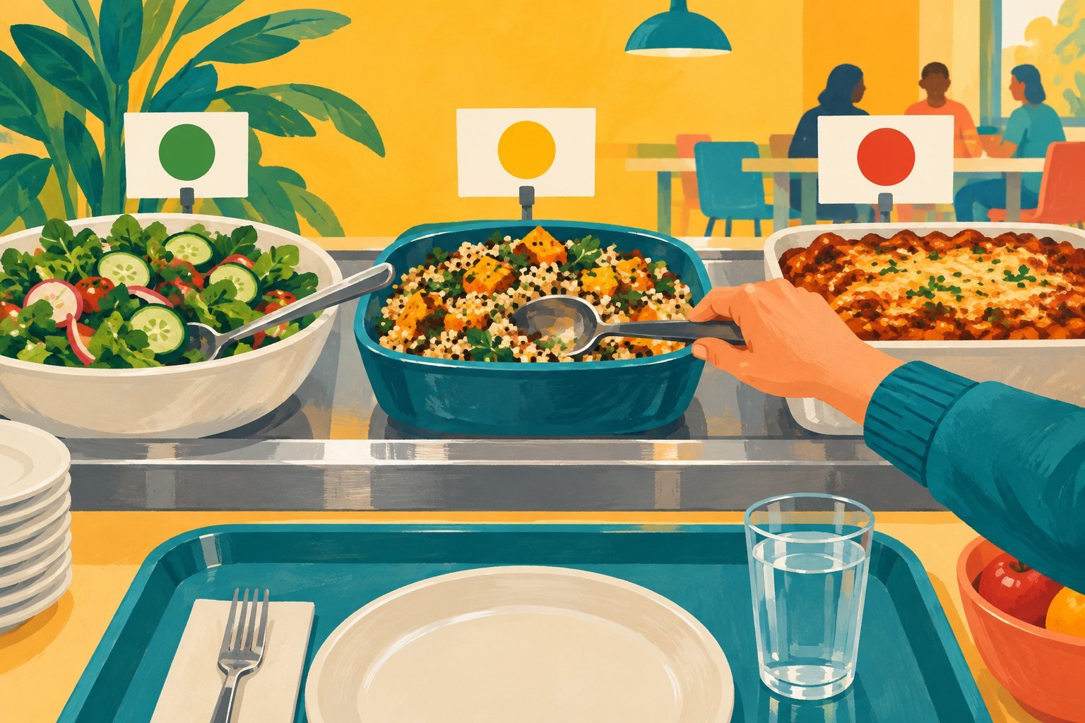
Green means go, red means stop—unless you are looking at lunch, where things get more complicated. Colour-coded labels try to make nutrition information easier to notice. That is a plausible idea. Whether people change what they eat is another question. A 2025 trial in a real cafeteria offers a useful reminder that giving information and changing behaviour are not interchangeable outcomes.
The lunch experiment
Published on 19 May 2025, the trial randomized 153 adults in a Shanghai company cafeteria to a menu-label programme or control. The programme combined labels rating added sugar, fat and sodium with post-meal nutrition reports delivered through an applet. At 12 weeks, none of those intake comparisons showed a statistically clear improvement. For sodium, the adjusted difference was −116 mg per lunch (95% CI −455 to +223), spanning both reduction and increase.
Notice, choose, consume
The setting makes a difference
The study covered weekday lunches, not entire diets. Leftovers were self-reported and recipe-based estimates have limits. A company cafeteria is not a supermarket or an Indian household. Chinese public research programmes funded the work; no conflicts were reported. The trial took place in 2022: the paper is recent, the lunches are not.
“No clear effect” is not “proved useless”
An uncertain result is easy to turn into an equally dramatic negative headline. That would make the same mistake in the opposite direction. A confidence interval that spans both directions means the estimate is not precise enough to establish the claimed improvement. It does not show that every colour label, in every setting, has exactly zero effect.
The trial tested a particular way of delivering information to a particular group. Different menus, education, prices or arrangements could ask different questions. You cannot assume those alternatives succeed either; they need evidence of their own. The useful result is a boundary around the claim, rather than a universal verdict on an entire category of tools.
A colour cannot describe the whole plate
Our everyday illustration: imagine deciding between two cafeteria dishes when you know one has more sodium but you also care about taste, cost and what you will eat later. A coloured cue is one piece of information. It cannot supply every preference or constraint. That example is our interpretation of the decision, not a measured explanation for the participants’ choices.
Another illustration: a small portion of one dish and a large portion of another may be different comparisons from the same-sized dishes. A summary label and the quantity consumed answer related but separate questions. When recording a meal, keep the amount and recipe context rather than expecting a colour to do all the arithmetic.
Why we wanted this story in the collection
A blog made only of exciting positive findings can become an accidental sales pitch for nutrition tools. Including a well-defined result that did not show the hoped-for improvement gives readers a more honest picture. Useful research can narrow a claim, question an assumption or reveal where the next experiment should focus.
PoshanSense is a journal, and a journal does not guarantee behaviour change. This trial did not evaluate our app, so it cannot establish the app’s effectiveness in either direction. The practical takeaway is to treat information as an aid you can examine, not an outcome you have already achieved. Your lunch is a decision made in a real day, with real constraints. A green dot does not get to pretend otherwise.
A question to keep for the next headline
Was the outcome understanding a label, buying a dish or consuming a nutrient? Those steps can diverge. A story becomes clearer when it names the step researchers actually measured.
Sources & further reading
Cover art is AI-generated conceptual illustration, not actual study participants, menus or microscopy. Diagrams are original PoshanSense graphics. Paper figures and publisher images are not reproduced. Examples and practical interpretations are identified in the text.
Published 5 October 2026 · Sources checked 5 October 2026. Suggest a correction.